This wide- and large- screen layout
may not work quite right without Javascript.
Maybe enable Javascript, then try again.
Town of Ipswich
Population Distribution (Age & Sex)
(If you're looking for even more detail than is presented here, you may wish to examine a graphical analysis of shifts in various aspects of Ipswich's population over the last two decades.) If on the other hand you prefer less detail, you may wish to instead examine this display of Ipswich's total population over the last century.
Shape - The Key To Understanding Charts
One can tell quite a bit about a city or country just from the shape of its age distribution chart. The following charts illustrate some of the most common shapes and explain their meanings. Reality is always messier than this — real age distribution charts are quite a bit more irregular than these idealized examples.

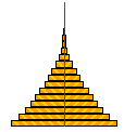
Stable
In the context of age distributions, a stable population is one that will be about the same next generation as it is this generation (although of course with different individuals). New births occur at a steady rate that balances deaths. A corollary of such stability is at any moment in time the population is a relatively equal mix of all ages.

LOLs
Without interference, nature is good at producing matching numbers of human males and females of marrying age. So charts are typically close to symmetrical ...except at advanced ages males drop out, so the highest age brackets are strongly skewed toward females. This Little Old Lady effect shows up in human population charts as a hook at the very top right.
(The hook is omitted from the rest of these illustration charts simply to focus exclusively on the factor being illustrated, not because the effect doesn't really exist.)

Graying
A population will look like this when the birth rate falls significantly below the death rate. Typically at the same time, there may be concerns that the society's health care delivery system and retirement supports will be overwhelmed and that the society will either have to solicit overwhelming immigration or disappear completely.
Currently some European countries are in this state.
Youth Bulge
The preponderance of young people indicates there will be rapid growth in the future (as well as that some rapid growth has already occurred). When a society begins industrial development, health care greatly improves, so most babies live and grow up to beget even more babies. Yet for a while couples continue to make babies as fast as they can like their parents did, even though there's no longer a good reason.
The U.S. "frontier" looked like this a century ago.

Closed Housing
A gated community or apartment building or other housing complex that disallows kids (or at least is very unfriendly to them) will look like this. Some age groups will be almost completely absent. If the population of a whole society (not just an area of housing) looked like this, it would indicate that something dramatic either had happened or was about to happen.

Sex Skewed
When a society acts on its strong preference for babies of one sex, the population age distribution winds up looking lopsided like this. Even though such preference choices make sense to each individual, the overall effect is to make marriages difficult or impossible, since there just aren't enough of the other sex to go around.
Currently China looks something like this (their preference has been for male babies).

After War
A population that would otherwise have been stable may be significantly altered by a war that results in the premature deaths of many soldiers (who in this example were mostly young males). This is what such a population looks like just after the end of such a war.
The U.S.S.R. looked like this right after WWII.

College Town
A college town will show a distinctive pattern of population distribution because of all the students. The age brackets that include students will be exaggerated. Where colleges are a significant part of the town, the town's population distribution may show the student age brackets many times longer than all the other age bracket bars.
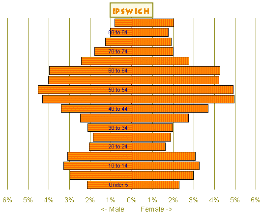
Ipswich Population Distribution
The chart immediately below is what Ipswich's population age/sex distribution looks like according to the 2010 federal decennial census. As with all charts of this type, male population is the bars that start at the center and go left, while female population is the bars that start at the center and go right. And the lengths of any pair of male/female bars are typically about the same so everyone can match a partner. Beginning at the bottom, each bar is an age bracket five years of age wide (under-5, 5-9, 10-14, 15-19, and so on up to the top 85-or-older bar which combines all the highest age brackets).
Just looking at the chart, there's the suggestion Ipswich's overall population is a little heavy on middle age and later, and quite light on both the childbearing years and very young children. One shouldn't draw too many conclusions from a single chart of this type though. Any chart of this type should be compared with other similar charts.
Is Ipswich Typical?
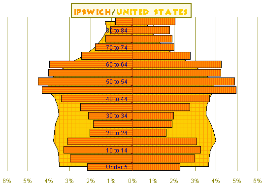
To find out if Ipswich is typical, the chart above overlays Ipswich on the whole United States, and the chart below overlays Ipswich on the whole Boston Metro area. These comparisons show that our initial guess was right, that Ipswich really is a little heavy on middle age and later, and quite light on both the childbearing years and very young children.
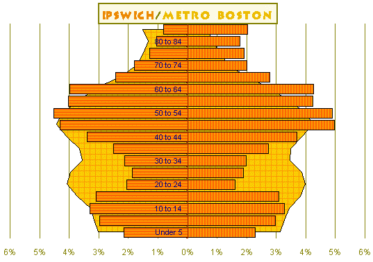
The U.S. Census defines the Boston-Cambridge-Quincy, MA-NH Metro Area" as Essex, Middlesex, Norfolk, Plymouth, and Suffolk counties in Massachusetts along with Rockingham and Strafford counties in New Hampshire.
Similar to Surrounding Communities
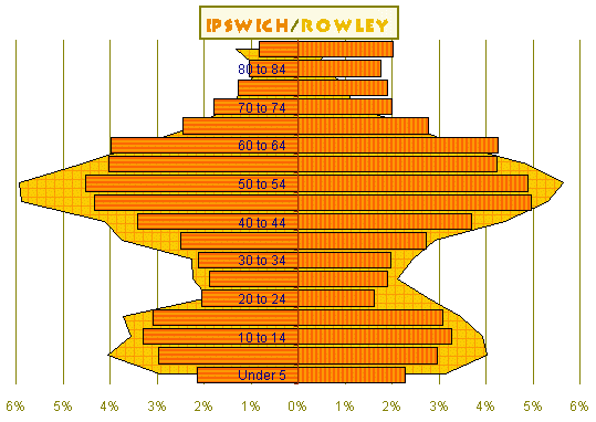
To find out if Ipswich is at least typical of surrounding communities, the first chart here overlays Ipswich on Rowley, and the second chart here overlays Ipswich on Newburyport. Ipswich doesn't look atypical when compared to surrounding communities. Although Ipswich's population age/sex distribution is skewed, it's just one of many nearby exurban communities that are similarly skewed.
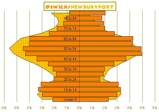
Surprisingly, even Newburyport shows the same skewness. Given that Newburyport has a reputation as a tourist town and is it's own thriving economic center, it seemed likely that the Newburyport population would be skewed in a different way from exurbs such as Ipswich. This isn't the case though; from the population age/sex distribution chart alone you wouldn't guess that Newburyport is a tourist town.
Urban Babies Become Suburban Kids
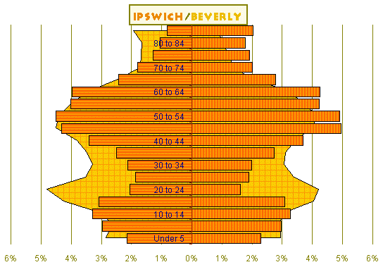
Comparing Ipswich with other nearby communities that are more urban, such as Beverly and Peabody, solves the mystery of where the people of childbearing age and the young children are: they're in these more urban areas.
Apparently what happens is many young couples start out in the more urban areas and many babies are born there. But after having babies, families often move farther out, perhaps to what seems like a better (or at least more familiar) environment for raising kids (and perhaps because they can now afford it).
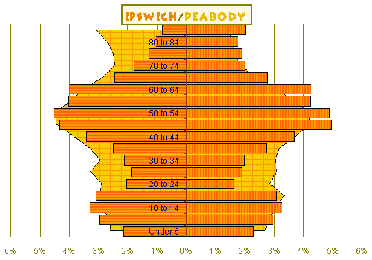
Peabody seems like more of a mature community than most other more urban areas on the North Shore, with more (often immigrant) seniors than other communities. So the expectation is Peabody's population age/sex chart will be skewed a little differently. This is indeed the case, but the skew is less than in Beverly. In Peabody the surfeit of people of childbearing age isn't as pronounced as in Beverly, and the portion of elderly people is larger.
(North America> USA> Massachusetts> Boston Metro North> Ipswich)
Email comments to Chuck Kollars
Time: UTC-5 (USA Eastern Time Zone)
(UTC-4 summertime --"daylight saving time")
 Chuck Kollars' other web presences include
Chuck's books
and
Chuck's movies.
Chuck Kollars' other web presences include
Chuck's books
and
Chuck's movies.
You may also wish to look at Dad's photo album.