This wide- and large- screen layout
may not work quite right without Javascript.
Maybe enable Javascript, then try again.
Ipswich
Demographic Changes
A good way to learn about what kinds of people live in Ipswich now is to look at how its population has changed over the last couple of decades.
In all the graphs below the red line or circle or bar is from the 1990 federal census, the purple line or circle or bar is from the 2000 federal census, and the blue line or circle or bar is from the 2010 federal census. The line charts are all histograms that focus on a distribution throughout the entire population. The doughnut (multiple pie) charts show all the components that add up to a full 100% circle.
Overall there's a suggestion of slow gentrification, without sudden or large changes. There's a shift toward older middle age and away from young families. And there's a shift toward higher incomes and more expensive homes. It doesn't seem that Ipswich is becoming less kid friendly, rather that young couples just entering their child-bearing years are increasingly simply priced out of Ipswich.
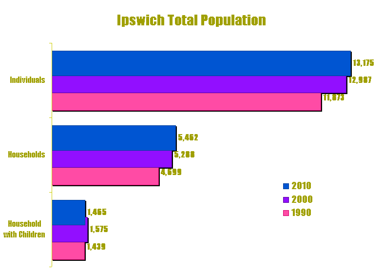
Population Growth
The overall population of Ipswich --whether counted as individuals or as households-- grew slightly (but not a whole lot) over the past couple of decades. The population of households with children however peaked in the 2000 census and has more recently dropped a little.
Here also is a chart of changes in Ipswich's population over the last century rather than just the last decade.
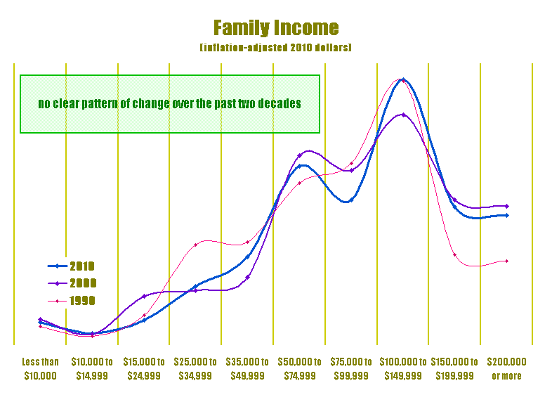
Income Distribution
The disribution of incomes in Ipswich families --at least as crudely measured by the census-- seems to have not changed a whole lot in the last twenty years. The data suggests there was some increase in the proportion of high end incomes among Ipswich families in the nineties, but the census data tops out before it can shed a whole lot of light onto that suggestion.
Income data for 1990 and 2000 has been scaled up to "2010 constant dollars" so the income distributions can be compared directly without having to keep any confounding factors in mind.
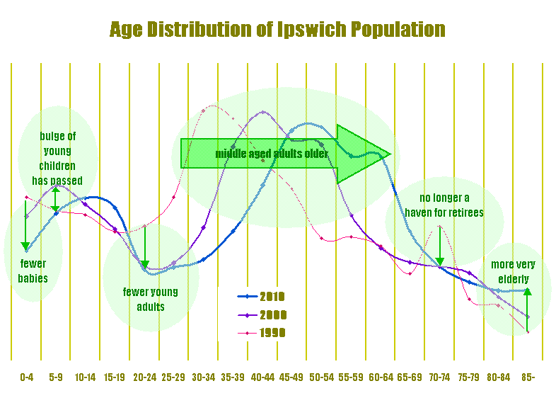
Age Distribution
The most significant changes in the population of Ipswich from 1990 to 2000 to 2010 are highlighted by the age distributions. A peak in the population just past retirement age in 1990 has now disappeared. (The proportion of very elderly people seems to have increased. Maybe this indicates more families caring for elderly parents, or maybe it's just a statistical fluke due to small numbers.) Middle aged adults have -unsurprisingly- gotten about ten years older every decade. The population of young adults has dropped. And there is a smaller group of toddlers (and the large group of young children in 2000 has gotten older to become a large group of young teens in 2010).
The overall indication is that Ipswich has fewer very young families (and more families that are getting older) than it once did.
The data for 1990 and 2000 have been scaled up to exactly match the total population in 2010 so the distributions can be compared directly without having to keep any confounding factors in mind.
Here also is a more detailed investigation and more common presentation of the age and sex distribution of Ipswich's population using data from the 2010 federal decennial census.
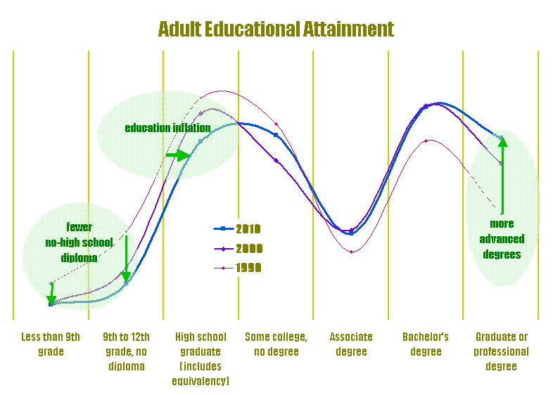
Educational Attainment
Adults in Ipswich have fairly similar levels of education as they did in 1990. Most have at least high school diplomas. Quite a few have some college, and a few have two year college diplomas. Many have four year college diplomas, and some have advanced college degrees. There has been a slight overall ratcheting up. This ratcheting up is especially noticeable at the very bottom (the portion without a high school diploma has fallen consistently since 1990) and the very top (the portion with advanced degrees has risen consistently since 1990).
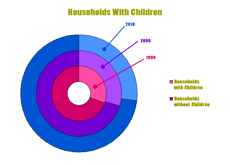
Households With Children
The proportion of Ipswich households that include children continues to drop inexorably. (Remember, follow the rings from inner to outer to move from oldest to newest. As always, red is 1990, purple is 2000, and blue is 2010.)
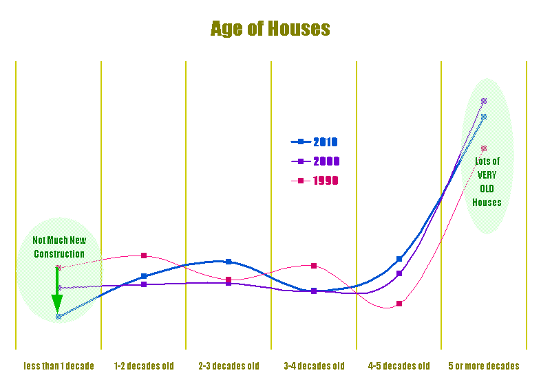
Age of Houses
Ipswich is full of houses that are much much older than what the census expected, so most of our houses are in their last category. Well duh!
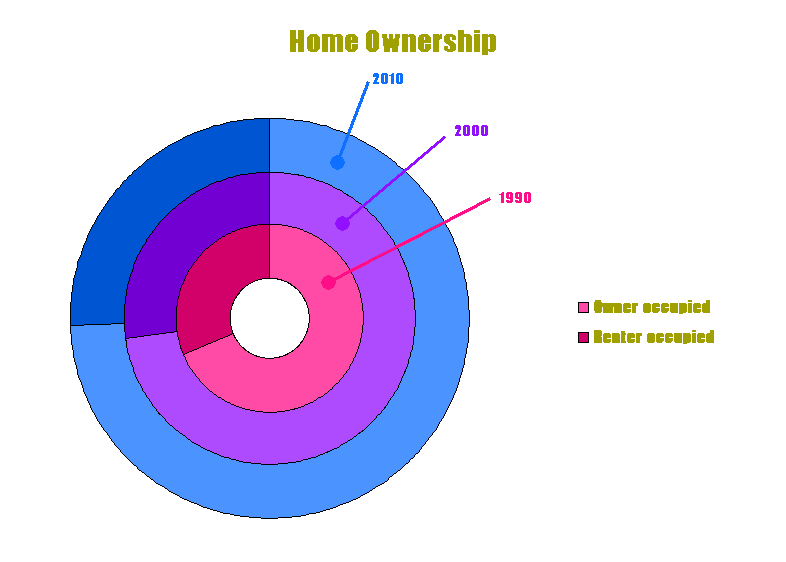
Ownership of Homes
The majority of households in Ipswich own their own (or at least the bank owns them:-). This tendency has grown even a little further over the last couple of decades.
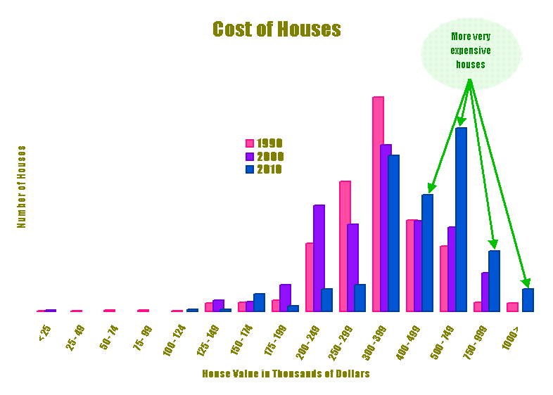
House Cost Distribution
The distribution of the cost of a house in Ipswich has shifted higher. (In 2000 there was already a hint that there were more very expensive house in Ipswich, but that hint was still ambiguous. Now with 2010 data as well, that hint has become a clear trend.)
House cost data for 1990 and 2000 have been scaled up to "2010 constant dollars" so the cost distributions can be compared directly without having to keep any confounding factors in mind.
Moved
Although earlier data here compared the two decades 1990 and 2000, no data comparing how many people changed residences in the three decades 1990, 2000, and 2010 is presented. That's because while the 1990 and 2000 censuses counted how many people changed residences in the past five years, the 2010 census counts how many people changed residences in the past one year.
(This morphing of census questions happens frequently everywhere - very few questions are exactly the same on the 2010 census as they were on the 1990 census. In most cases I've been able to compensate for the change, often by finding and reporting a lowest common denominator. But in this particular case I could not figure out any simple way to compensate.)
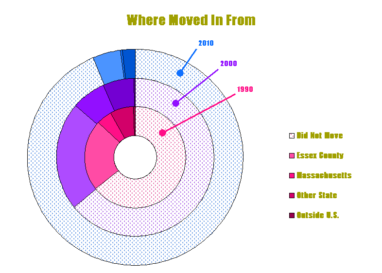
Moved From Where
Of the people that moved into Ipswich, many came from fairly close by. The tendency in 2000 was roughly the same as in 1990.
The pronounced tendency in 2010 though was to not move at all. I expect this is just a snapshot of anomalous behavior caused by the housing crisis (or financial meltdown), and that future data will return to something similar to the 2000 data.
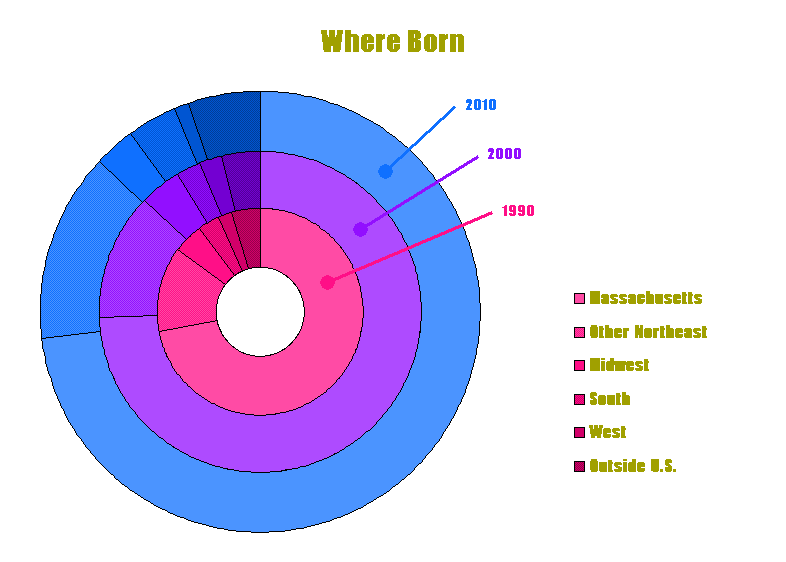
Birthplace
Of all the people living in Ipswich, many were born fairly close by. Not insignificant proportions were born further away though, some even in another country. The proportions didn't change very much from 1990 to 2000 to 2010.
These comparisons are based on data from the U.S. decennial censuses. Although most other socioeconomic data is collected or estimated every few years and is also available from various other sources, income data forms a bottleneck. Even if it's obtained from somewhere else, all relevant income data is ultimately based on the U.S. census, and is only available in a useful form once a decade.
All of the above and much more census data is readily available:
Web browse to the U.S. Census American Factfinder website (factfinder.census.gov). A wealth of information is available there. In fact, so much information is available that the biggest issues may be finding the exact information you desire.
Whenever entering a geographic location, choose Ipswich town, Essex County, Massachusetts (not Ipswich CDP, Massashusetts, as CDP [Census Designated Place] is just the more urban part of our town rather than the entire area; and not Ipswich town, Massachusetts nor any Ipswich in South Dakota or New Hampshire). After specifying nothing more than the location (not even any particular topic), the very first data set listed provides a thorough summary that may tell you all you want to know without any further searching or clicking.
If a webpage begins to redisplay, always wait for the redisplay to complete before doing anything else. Specifically, when waiting for a page to redisplay, don't make any additional checks or clicks until the page is fully displayed (not even although more items appear below the one you just changed), as the additional selections from the old page may be lost or may confuse the web server.
The relatively narrow third column in each list of available data sets tersely indicates where and when that data came from. Of particular interest is the date, which is probably either 2010 (the most recent decennial census) or 2000 (the previous decennial census).
Data from both the current and the previous decennial censuses are readily available. Currently the census website offers 2010 and 2000 data; I retrieved 1990 data when it was still easily available from the census website and stored it locally. Datasets will probably be ordered with all the various 2010 data sets first, followed by the 2000 data sets. So you may need to scroll ahead one or more pages to find the 2000 data sets.
You can select several tables for viewing (and printing), or downloading, or comparing, by checking the box next to each item you're interested in. Or you can view a table immediately -without even checking its box- simply by clicking right on the name of the table. Many tables can be viewed in both a Map view and a Table view.
If you wish, you can download tables in CSV (Comma-Separated Values) format for ready incorporation into your spreadsheet. Downloaded tables tend to have many many columns and to have very verbose headings in a separate file. So if you wish to calculate with the data in your own spreadsheet, you may wish to transpose from columns to rows and/or merge the values and headings into a single spreadsheet and/or summarize the headings less verbosely.
Wherever dollar values are compared (incomes, house costs, etc.) in any of the above graphs, data obtained from the census has been scaled to "2010 constant dollars" using the usual inflation rates from the CPI, so the distributions can be compared directly as though all other factors were constant. Dollar values from the 2010 census were used as is, dollar values from the 2000 census were multiplied by the inflation factor of 1.2663 for 2000 to 2010, and dollar values from the 1990 census were multiplied by the inflation factor of 1.6684 for 1990 to 2010.
And wherever population distributions are compared (ages, etc.) data obtained from the census has been scaled to separate the distribution changes out from any overall population change. To do this, usually the distributions were converted to percentages (since 100% is always the same for everybody). In a few cases population data was converted to constant people (analogous to constant dollars). This was done by using population values from the 2010 census as is, multiplying 2000 census data by the growth factor of 1.0145 from 2000 to 2010, and multiplying 1990 census data by the growth factor of 1.1097 from 1990 to 2010.
Updated October 2012
(North America> USA> Massachusetts> Boston Metro North> Ipswich)
Email comments to Chuck Kollars
Time: UTC-5 (USA Eastern Time Zone)
(UTC-4 summertime --"daylight saving time")
 Chuck Kollars' other web presences include
Chuck's books
and
Chuck's movies.
Chuck Kollars' other web presences include
Chuck's books
and
Chuck's movies.
You may also wish to look at Dad's photo album.