This wide- and large- screen layout
may not work quite right without Javascript.
Maybe enable Javascript, then try again.
Inflation
We may casually toss off the expression "a dollar isn't worth what it used to be" without realizing just how true it is. The two charts below help illustrate the changing value of money. Perhaps the biggest lessons of these charts and calculations are:
- The effects of uncontrolled inflation can last for a very long time. The long term effect of a period of serious inflation can change everything half a century later, This is in addition to its short term effect of effectively forcing a transfer of wealth from older generations to younger generations.
- Persistence wins (like the tortoise who won the race with the hare). Even just a very small (less than 1%) rate of inflation operating consistently over the years will change the value of money quite noticeably over the time it takes a person to age from young adulthood to retirement. Even with current "best practices," low but consistently positive inflation means buying a house may not provide for old age.
If we wanted money to keep its value over a lifetime, we'd have to have slight deflation about as often as slight inflation.
The first chart below graphically illustrates inflation in the USA recently by showing the same price in dollars as it's changed over the last 80 years.
For the first chart Consumer Price Index (CPI) data was scaled so the example price was $1.00 in 1962. (Current CPI statistics use 1982-83-84 as their $1.00 base, with historical data mathematically adjusted accordingly.) With that same 1962 scaling, it had grown to $7.21 by 2010. The right of the chart shows inflation that's affected current senior citizens from the time they were young adults. The left of the chart shows inflation when current senior citizens were children.
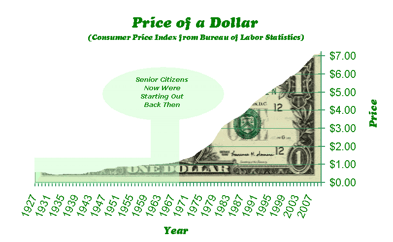
An easy misinterpretation of the above chart
is the steepness
of the upper border
corresponds to the rate of inflation.
Actually the steepness depends on how high the bottom already is;
 this sort of chart plays down the rate of inflation where prices are low
and exaggerates the rate of inflation where prices are high.
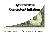
If the rate of inflation were constant,
on this sort of chart the upper boundary of the dollar bill would
be a power curve
(like the example at left).
The curve would get steeper and steeper.
The fact that on the full scale value of a dollar chart above
the steepness in recent years
does not get even worse (in fact it moderates a little)
means that the rate of inflation has slacked off significantly.
this sort of chart plays down the rate of inflation where prices are low
and exaggerates the rate of inflation where prices are high.
If the rate of inflation were constant,
on this sort of chart the upper boundary of the dollar bill would
be a power curve
(like the example at left).
The curve would get steeper and steeper.
The fact that on the full scale value of a dollar chart above
the steepness in recent years
does not get even worse (in fact it moderates a little)
means that the rate of inflation has slacked off significantly.
One way to get a sense of the rate of inflation is with a separate chart rather than trying to figure out the rate of inflation from the prices chart above. This second chart below shows the rate of inflation over the same years. To make the chart a little less jumpy, the points are a moving average of three years, the current year, the year before, and the year before that.
This second chart makes it clear that although the rate of inflation was quite high for over a decade in the 70's, it is now greatly reduced. The rate of inflation chart also shows the pronounced dip during the great depression, and a peak during and a second peak after World War II.
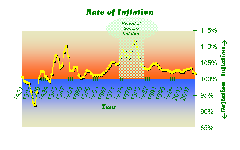
The source of this information is the national urban Consumer Price Index as recorded by the U.S. Department of Labor - Bureau of Labor Statistics. Although CPI measures inflation very well over short periods of a few years, it's more problematic when used to measure inflation over a period many decades long. Nevertheless the available CPI statistics are the best measure available of inflation in the U.S. and are universally used for this purpose.
(North America> USA> Massachusetts> Boston Metro North> Ipswich)
Email comments to Chuck Kollars
Time: UTC-5 (USA Eastern Time Zone)
(UTC-4 summertime --"daylight saving time")
 Chuck Kollars' other web presences include
Chuck's books
and
Chuck's movies.
Chuck Kollars' other web presences include
Chuck's books
and
Chuck's movies.
You may also wish to look at Dad's photo album.